Warrington Head Office
Phone: 01925 636 473
Email: admin@adelecarr.co.uk
Liverpool Office
Phone: 0151 832 9626
Chester Office
Phone: 01244 662 464
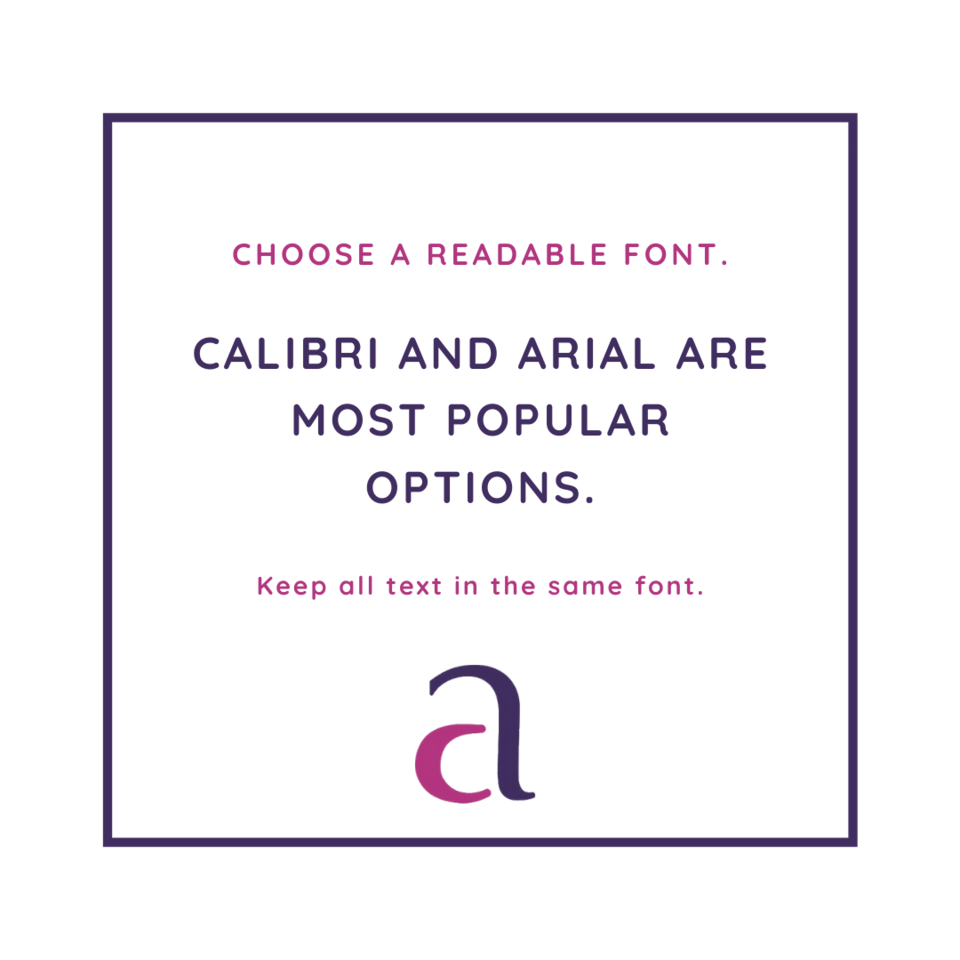
Before you press send, is your font choice readable? The last thing most people think of when typing up a letter or CV is the font type. The typeface you decide upon sets the tone for your whole document and essentially provides a first impression of who you are. Before the reader begins to look at what is written they see the font. Within the first glance our brains will detect how readable something is and how likely we'll actually read it.
The most popular font choices are Calibri and Arial. These fonts present a neat and tidy style with a good amount of spacing between each letter.
You should avoid 'script' fonts that are cursive and Comic Sans which can come across as childlike. Despite Times New Roman being one of the default fonts for Microsoft Word, it is strongly suggested that this typeface be avoided as it is overused and old fashioned.
Phone: 01925 636 473
Email: admin@adelecarr.co.uk
Phone: 0151 832 9626
Phone: 01244 662 464
Phone: 0161 924 2261
Phone: 01772 914 121
Phone: 0161 258 0922
Phone: 01942 363 415
